
Responsive web design means ensuring your website’s layout, images, and functionalities are optimal and offer a consistent user experience, whether your audience is accessing your site from a desktop, mobile, or tablet. According to StatCounter, as of July 2023, the global internet traffic was divided among:
- Mobile (55.67%)
- Desktop (42.4%)
- Tablet (1.93%)
But how do you ensure your website works on every device in the world? Does this mean you need to create a version of your website for each device? That would be impossible! Especially since there are thousands of different devices that vary in size and resolution. Here’s where responsive web design comes into play. So to answer your question, YES, your business website needs responsive design, and if you’re not adapting to this new trend, your decision could be costing your business revenue. 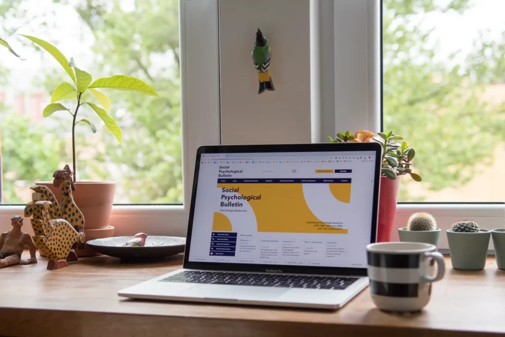
What does responsive mean in web design?
Responsive web design is characterized by its ability to adapt to various screen sizes and orientations seamlessly. It’s about ensuring that your website’s aesthetics and functionalities are not compromised, irrespective of the device it’s accessed on.
The core components of responsive design
As mentioned before, responsive web design is a comprehensive approach that ensures a website’s optimal performance and appearance across different devices and screen sizes. This is how websites are designed to be responsive:
- Fluid grids: Fluid grids are the backbone of responsive design as they ensure that layout elements are resizable and adaptable, and adjust gracefully across different screen sizes, prioritizing the user’s visual experience, readability and navigation.
- Flexible images: Images and graphs are integral to the user experience, and in responsive design, they are engineered to be as adaptable as the layout. In responsive design, images scale to fit varied screen resolutions without losing quality and preventing distortion.
- Responsive typography: Typography in responsive design is adaptable, ensuring that text is readable and accessible across devices. Font size, line height, and spacing are calibrated to offer an optimal reading experience.
- Mobile-first approach: The mobile-first approach focuses on the performance and loading speeds essential for mobile users. This is essential since Google prioritizes mobile-friendly websites, so optimizing your website for mobile devices will bring SEO advantages.
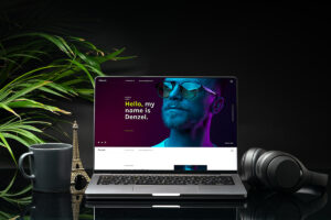
Examples of responsive design websites
It is no surprise that responsive design has been adopted by giants like Apple, Amazon, and Google. These websites offer users a consistent and intuitive browsing experience across devices. Here are some great examples of responsiveness in web design: This is Apple’s home screen in a 13,6’’ laptop: 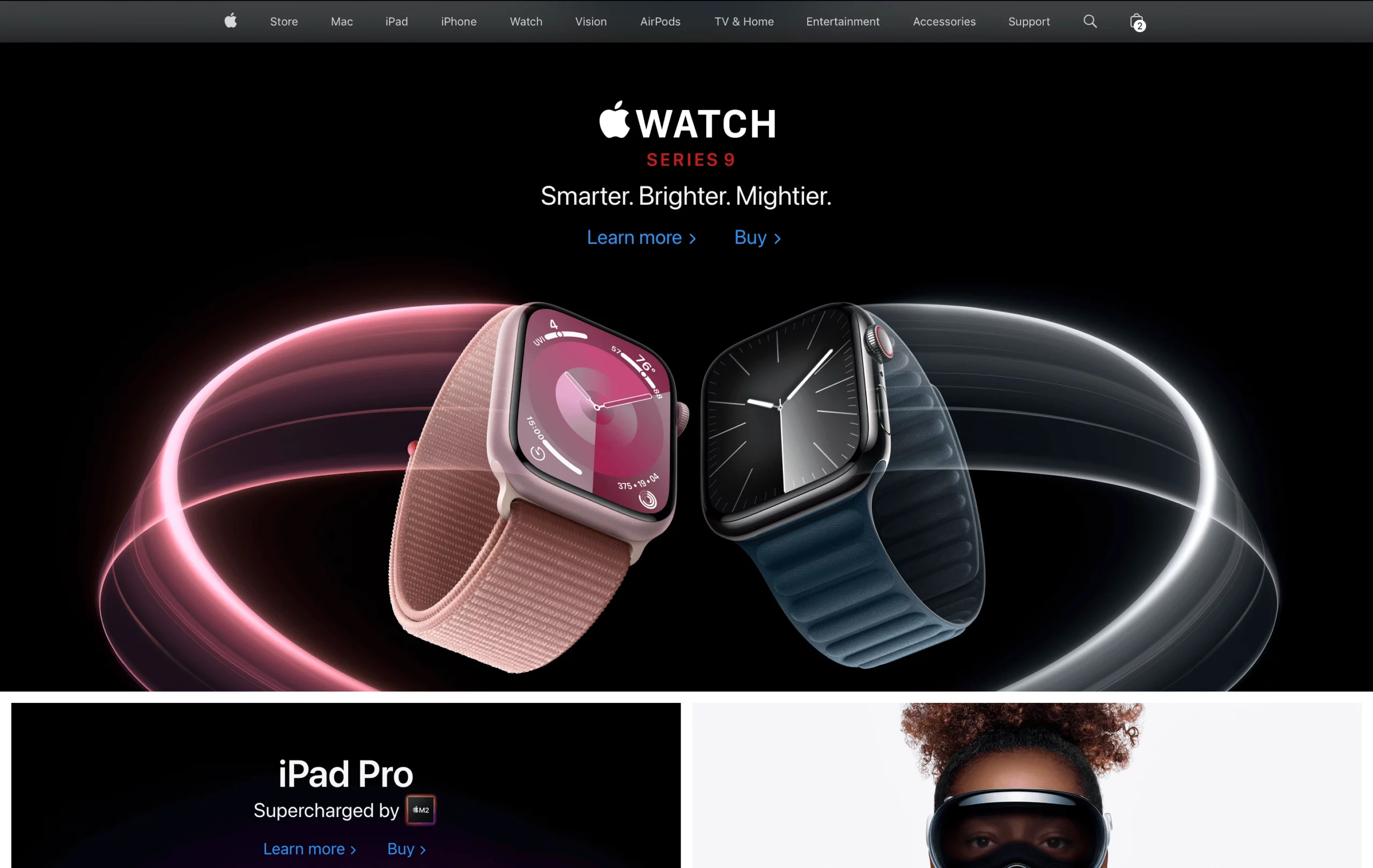 And this is Apple’s website on a smaller device (6.7’’ iPhone):
  This is Canva’s home page on a 13,6’’ laptop:
 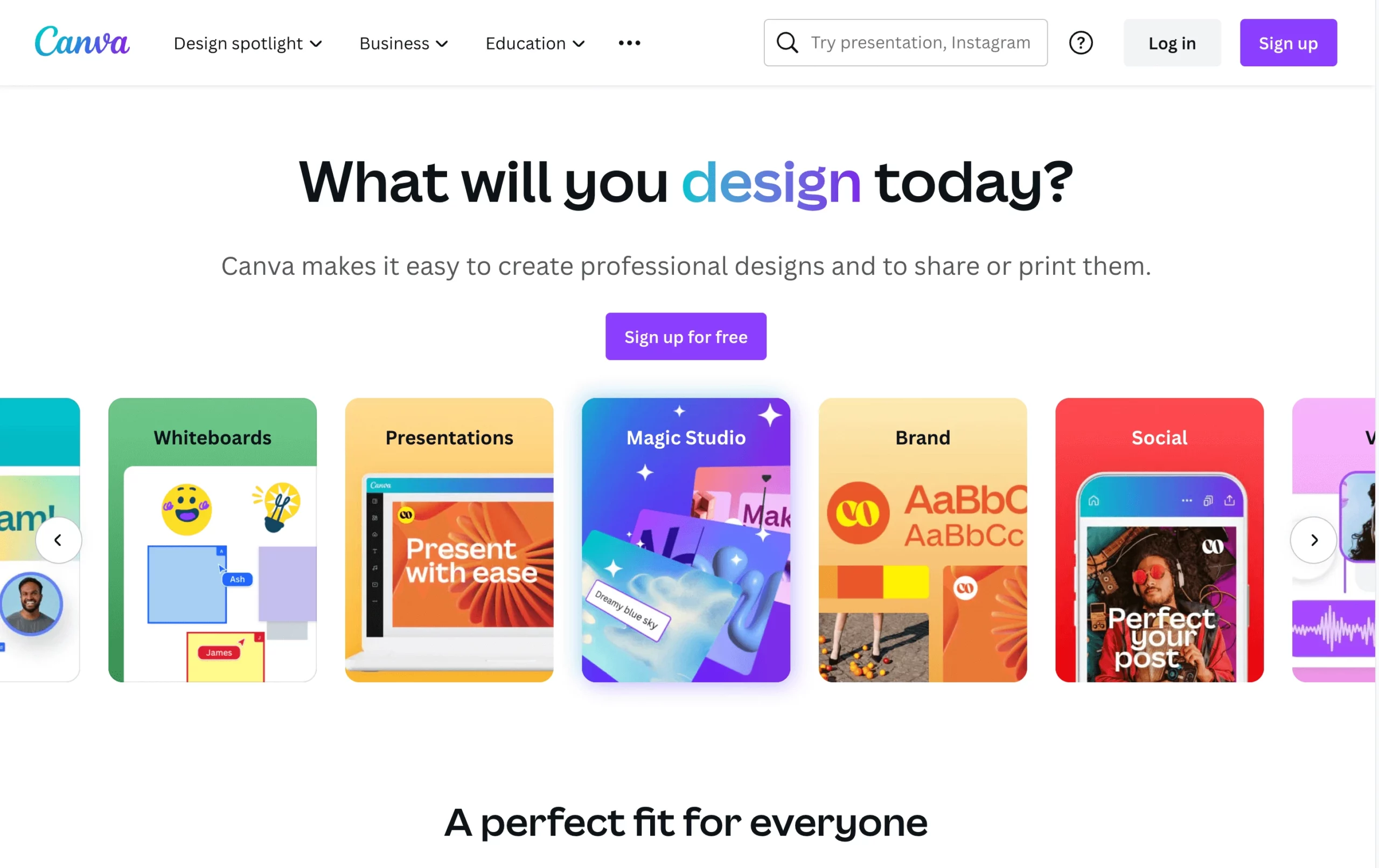 And Canva’s home page on a 6.7’’ iPhone:
 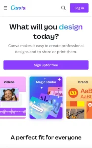 As you can see:
- The visual elements adapt gracefully, maintaining the brand’s iconic aesthetic integrity.
- Content is displayed in a readable and engaging manner, enhancing user engagement.
- The navigation menu is fluid, ensuring usability and accessibility across devices.
The ROI of investing in a responsive website
Now that we’ve stated that responsive web design isn’t a luxury but a necessity, making your site responsive is not an expense but an investment. A slow or unresponsive site can quickly deter customers, impacting their loyalty and your bottom line. Here’s why investing in responsive design is a smart business move:
- Google recently revealed that a poor mobile experience could significantly affect a company’s customer engagement and retention.
- According to Urban Menu, 52% of users have stated a bad mobile experience made them less likely to engage with a company.
- 74% of visitors are likely to come back to your site if it has good mobile UX, and 90% of smartphone users say they’re more likely to keep shopping if they’re having a great user experience.
- According to Statista’s Market Insights, “mobile e-commerce sales reached $2.2 trillion in 2023 and now make up 60% of all e-commerce sales around the world.” Ignoring mobile responsiveness isn’t just a design oversight—it’s a direct path to losing nearly a quarter of your sales, a figure that’s only set to rise as mobile shopping continues its upward trajectory.
Responsive web design is an investment that pays dividends in enhanced customer experience, increased sales, and increased brand loyalty. If you’re still having second thoughts about implementing responsive website design for your company, let’s talk! We’re an experienced web design agency and we’ll be happy to answer your questions in real time.
|
What other benefits does responsive web design offer?
-
Stronger SEO
Google’s algorithm favors mobile-friendly websites, and responsive design is a key factor in this preference. But the SEO benefits extend beyond mobile optimization. With better SEO performance, responsive sites draw more traffic, elevate brand awareness, and boost conversion rates. A higher Google ranking can potentially double your ROI.
-
Better user experience
The user is at the core of responsive design. It ensures that the website is as intuitive, navigable, and user-friendly as possible across all devices.
-
Easier decision making process
Responsive design streamlines the user journey, making it easier for customers to make decisions and take action. Clear, concise, and well-organized content aids quick decision-making, and easy access to information and functionalities accelerates the user journey.
-
Cost-effectiveness
Building and maintaining one responsive site is more cost-effective than having separate desktop and mobile sites. Streamlined operations and maintenance reduce ongoing costs as well. Also, your company resources can be focused on enhancing one responsive site, ensuring optimal performance and user experience.
-
Higher conversion rates
Responsive web design directly impacts the bottom line by boosting conversion rates. The site’s adaptability to various devices ensures users can easily complete transactions wherever they are, boosting conversions.
How to implement responsive web design in your website
Implementing responsive web design requires a combination of strategic planning, design proficiency, and technical expertise. Here’s a quick guide on how to effectively implement responsive web design:
- Understand your audience’s behavior, preferences, and the devices they use.
- Identify your website’s key functionalities that need to be optimized for various screen sizes.
- Develop wireframes for different screen sizes to plan the layout and user interface.
- Focus on intuitive navigation and interaction to enhance the user experience.
- Use fluid grids to create flexible layouts that adapt to different screen sizes.
- Ensure images are resizable and do not distort on different devices.
- Test the website on different devices to ensure consistency and functionality.
- Enhance loading speeds and performance for a smooth user experience.
- Update content and functionalities to meet the evolving needs of users.
- Adapt to new technologies and trends to keep the design current.
While understanding the complexities of responsive web design is beneficial for you as a stakeholder, executing it effectively requires a specialized skill set, experience, and tools. This is where delegating this crucial task to a professional responsive web design company like Antimatter, becomes a strategic advantage. Our web designs are not just aesthetically appealing but are engineered to drive business growth. We focus on ROI, ensuring that every element of the design contributes to enhanced user engagement, conversions, and business revenue. Choosing Antimatter means partnering with a team that is committed to excellence, innovation, and results. We take the time to understand your business, audience, and objectives, translating these insights into a responsive web design that resonates with your audience, enhances user experience, and drives business growth. 
Here at Antimatter, we can help future-proof your business with conversion-focused responsive web design!
Our expertise is rooted in a deep understanding of the digital scenery, user behavior, and innovative web technologies. Your future-proofed, conversion-optimized responsive website is a conversation away. Book a time with one of our expert web designers!